Blogs
Google Chrome: A Powerful Instrument for Web Development!!

In the world of web, Google Chrome is a rising Hero which is apparent from the analytical data, 40% of users are deriving their selection on Google Chrome to browse the world because of numerous features that bestow speed and consistency. Even chrome permits the installation of third-party extensions without any constraints and Google itself creates amazing extensions using pure HTML, CSS as well JavaScript. Web developers are grabbing these aspects to convert their efforts into the best output. How developers select any specific tool to accomplish aimed development process, which I have covered in this article.
Responsive Web Applications and GoogleChrome
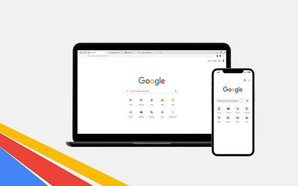
The Latest version of Chrome has introduced an advanced feature that will asset you to develop a responsive website, which is one of an essential demands of clients when they are asking you for web development, due to the increased use of web surfing on various instruments, i.e. mobiles, desktop, tablets all are having different resolutions. You can learn web development at an advanced level at TOPS Technologies.
By writing the above code and creating a CSS class with some basic rules like floating the navigation links and creating two sections, which are positioned to each other, will generate the output as below. After getting the following output, you can start to experiment with your HTML and CSS.
Firstly place media query breakpoints. Make sure to select the breakpoint based on the content and at where the content is not looking perfect. Note: you should not assume that 2014×768 is a perfect resolution as it is popular.
Setting the Viewport using Chrome
The very first step is that break the site by selecting break points in small portions to experiment with that. But what happen if we break the content we can’t see the exact viewport of the browsers, for that we need to resize the browser’s window.
Chrome Solution: Chrome provides the developer tools panel, from where you can increase the size of the viewport easily that you can see the changing size of the viewport in the top right corner of the browser. This solution removes your bothersome manual checking work.
Now look at the two sections of the content which have become so squashed by 500px. Here we need to increase the space between both content by adding the Media query.
After adding the above media query we can see the space, but as we go a bit below that for e.g 540px, a horizontal navigation bar will appear at the bottom of the viewport. For that again we need to add a new media query definition to solve that problem.
After completing the above coding you can see the web page that will now work for a wide range of the screen. This was a very simple example with two break points, but yes, you can do it for any of the breakpoints with the same process regardless of the size of the site.
Device Simulation using Chrome
Problem: Often we get queries from our clients that your application is not running properly on Apple iphone5 or Google Nexus S.
This is very obvious while you are creating a web application by considering every single mobile and table. You need to set the exact screen resolution and right HTTP headers to make it fix. You can do it easily by getting a close look on how your web application will see on any device.
Chrome Solution: Chrome can set the exact screen resolution and can create exact HTTP header for getting any device view. For example, if you want to simulate Google Nexus S. Go to the Developer tools that will open a drawer panel where you will find the Emulation tab at the bottom line of the drawer, click on the emulation tab you will have all the devices in the drop-down menu and select Google Nexus S to see how your web application will look at the screen of the Google Nexus S, This is possible because chrome applies all the settings in the Screen, User agent, and Sensors Sections according to the device you select.

Get 100% Job Assistance & get placed in your dream company
Job Assistance
3000+ Companies Tie-Ups
What you can do with a Modification panel of Chrome
If your website is responsive, but you want to check different styling to your website then you can do it by using an element panel of Chrome. Using an element panel of Chrome you can check what styles are applied to your webpage that you are seeing it at the right side and you can modify the style and see on the webpage simultaneously.
Finding certain CSS styles using Chrome
Sometimes, what happens that in the large content you won’t be able to find a certain CSS type easily to do the modification due to a lot of definitions. Google Chrome solves this problem with its filter field in the developer tools panel.
For an instance, if you want to access the
Debugging JavaScript using Chrome
Chrome has integrated JS debugging which helps to debug JS files. You can see details of the JS file in the chrome console and source viewer. You can see how the debugging works in Chrome by the following example. In the below example, we want to change the Examples label to the awesome examples on the click event.
Once you complete the coding and run it in the browser, you will be able to debug it using Chrome. At below you can see how the code works.
In the above Example we are getting the same output for any click is: do nothing… , By this we can see that in our coding there is some error for what we are getting the same output, it seems that if the condition is being always false.
We need to set breakpoints to see what’s going on. While we set the breakpoints the debugger stops at our breakpoint and shows the local variables that we have defined. You can see that the Variable clicked points to the navigation element and not to the element. This is the reason why we are getting the do nothing… every time. This can be solved by adding .nav an instead of .nav, as shown below.
Second, most astonishing feature of the Browser is you can create your own extension for yourself only, and for that there is no need to learn any programming language. What you need to know is just HTML, CSS and JS (Java Script). You may have no idea how to create an extension. Well, here are the fundamentals of extension development. You can learn more in-depth by pursuing a web development course.

I wish my article would be useful for all the users of Google Chrome who were unaware of some hidden functionality of Google Chrome. Now I am sure that you will agree with me that yes, Google Chrome can also play a major role in web development. TOPS Technologies offers the best training courses for your career.
The top technologies course is designed to teach students about the latest and greatest technologies. It will cover web development, front-end course, programming languages, and more. If you want to be successful in the IT field, it's important that you have a good understanding of all the latest technologies. It training is perfect for anyone who needs to be ready for a career in the IT field. Learn android programming from our expert trainers and gain skills that are in high demand! The training course is perfect for anyone who needs to be ready for a career in the IT field. Learn android programming from our android training institute. We provide the best web designing course in Rajkot, Surat, Vadodara, Ahmedabad, Rajkot, and Nagpur with live projects and 100% placement assistance.
Author Bio:
Niral Modi works as a Chief Executive Officer at TOPS Technologies, which is an Education company with an estimated 303 employees; and was founded in 2008. They are part of the Executive team within the C-Suite Department, and their management level is C-Level. Niral is currently based in Chicago, United States.
TOPS Technologies offer the Best web designing course in Surat, Hardware Training Classes, Graphic Designing & Web Design Training through Live Project Training. Having tie-ups with 3000+ IT software development companies, We provide a 100% Job Guarantee in Software Development Courses. We are known for our training courses in PHP, Python, Java, Android & iOS, and Asp. Net, C & C++, Angular Courses, IoT, Software Testing, CCNA, Cloud Computing, Ethical Hacking, Hardware Networking, Cyber Security Training, Digital Marketing, MVC Training, and SEO. We also teach Laravel, Nodejs, Unity 3D Game Development, Machine Learning with Python, Data Science, and web designing training!"
Other Categories
Jobs/ Careers
iPhone-training
Blogs
Php-training
Web Design-training
Android-training
Asp.Net-training
Software Testing-training
SEO-training
Java-training
Tips for Interview
GTU Project training in Ahmedabad
drupal training
joomla training
magento training
WordPress Training
project training
Graphic Designing
Live project training
python
ccna
ethical Hacking
Networking
Digital Marketing
Java Course
Web Designing Courses
Web Development
Ethical Hacker
Web Designer
Career Opportunities
Java Job
PHP Job
Software Testing
Java Developer
Android
Graphic Designers
Java Programming
Website Designing
ASP.Net
Hardware Networking
PHP
Data Science
Web Designing
News
Robotics
Machine Learning
Articles & Advice
Node.js
Cloud Computing
Current Updates
Tips for Making PPT
IT Courses
Java
Graphic Design
Placement Success Story


